


Turning Data into Insights: Data Visualization in Web and Mobile Apps

In web and mobile applications, data visualization transforms raw information into user-friendly insights. Whether helping users track finances, monitor fitness, or manage projects, effective data visualization bridges complexity and understanding. It allows users to grasp trends, make informed decisions, and achieve their goals efficiently.
For businesses, it’s more than a design feature—it’s essential for engaging users and delivering value. Poor visualizations confuse and frustrate users, while well-crafted ones enhance experiences, build trust, and set apps apart in competitive markets.
The Role of Design in App Data Visualizations
Successful data visualization starts with clarity and simplicity. Highlighting essential data while removing unnecessary details ensures users focus on what matters. Logical arrangements and storytelling guide users toward actionable insights. For example, a fitness app showcasing weekly activity trends should emphasize patterns and progress through clean, intuitive design.
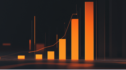
The choice of charts plays a critical role.
- Bar charts are excellent for comparisons, such as tracking expenses or steps across days.
- Line charts excel at illustrating trends over time, like calorie intake or sales growth.
- Pie charts work for part-to-whole relationships but are best for simple datasets to avoid confusion.
Purposeful use of color further enhances visualizations. In financial apps, for instance, red might signify loss, while bold colors can highlight achievements. Overusing colors, however, can overwhelm users. A well-designed app balances vibrant highlights with subdued backgrounds for clarity.
Interactivity transforms visualizations from static displays to dynamic tools. Apps that let users toggle between charts and tables or filter data by categories empower deeper exploration. For example, a financial app could enable users to view spending trends while also diving into detailed transaction data. Features like sortable tables, frozen headers, and expandable rows improve usability, especially in data-heavy apps like project management tools.
Choosing the Right Tools for App Visualizations
Selecting the right data visualization library is critical for building impactful apps. The choice depends on your app’s goals, complexity, and interactivity needs.
- D3.js is highly customizable and suited for unique, interactive visualizations but requires advanced development skills.
- Chart.js offers lightweight, simple visualizations, making it ideal for prototypes and straightforward apps.
- Highcharts provides polished visuals with minimal setup, perfect for business intelligence dashboards.
- Plotly excels in analytics and Python integration, supporting complex features like 3D charts.
- ECharts is optimized for handling large datasets and real-time updates, making it a go-to for IoT dashboards and monitoring tools.
When choosing a library, consider scalability, licensing, and ease of use. Open-source tools like D3.js allow full customization but demand significant time investment, while paid tools like Highcharts simplify implementation with professional results. The right library balances your app’s current needs and future growth.
Why Thoughtful Visualization Matters for App Success
In web and mobile applications, effective data visualization isn’t just about displaying information—it’s about helping users make sense of it. Clear, interactive visualizations empower users to understand trends, make confident decisions, and engage with your app meaningfully.
For businesses, thoughtful visualization drives user engagement, boosts retention, and builds loyalty. Whether managing budgets, tracking health, or monitoring operations, apps that prioritize purposeful visualizations ensure users experience the full value of your product.
By focusing on clarity, interactivity, and intentional design, data visualization becomes a bridge from information to action. It transforms apps into tools users trust and rely on, making your product an indispensable part of their daily lives.
Download Ballast Lane’s Best Practices for Data Visualization here.